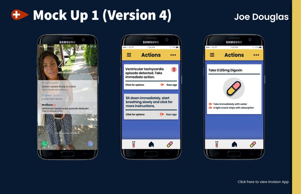
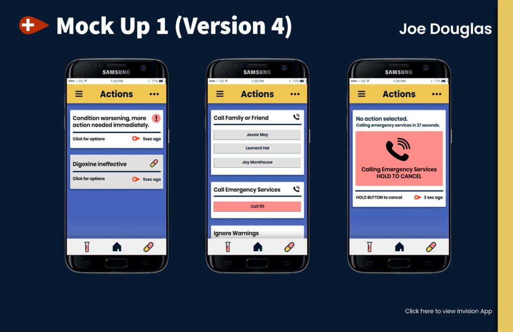
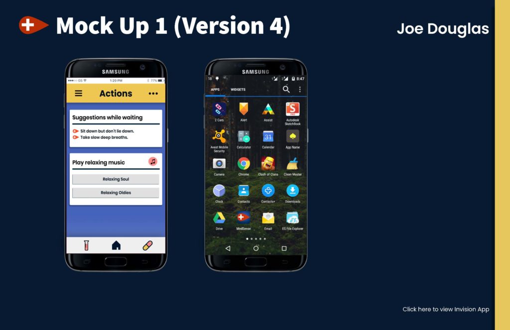
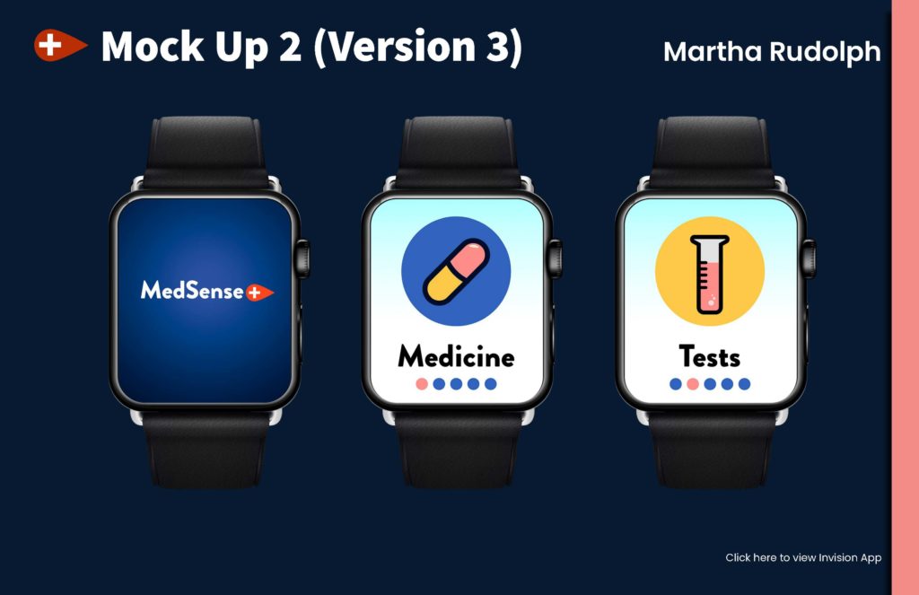
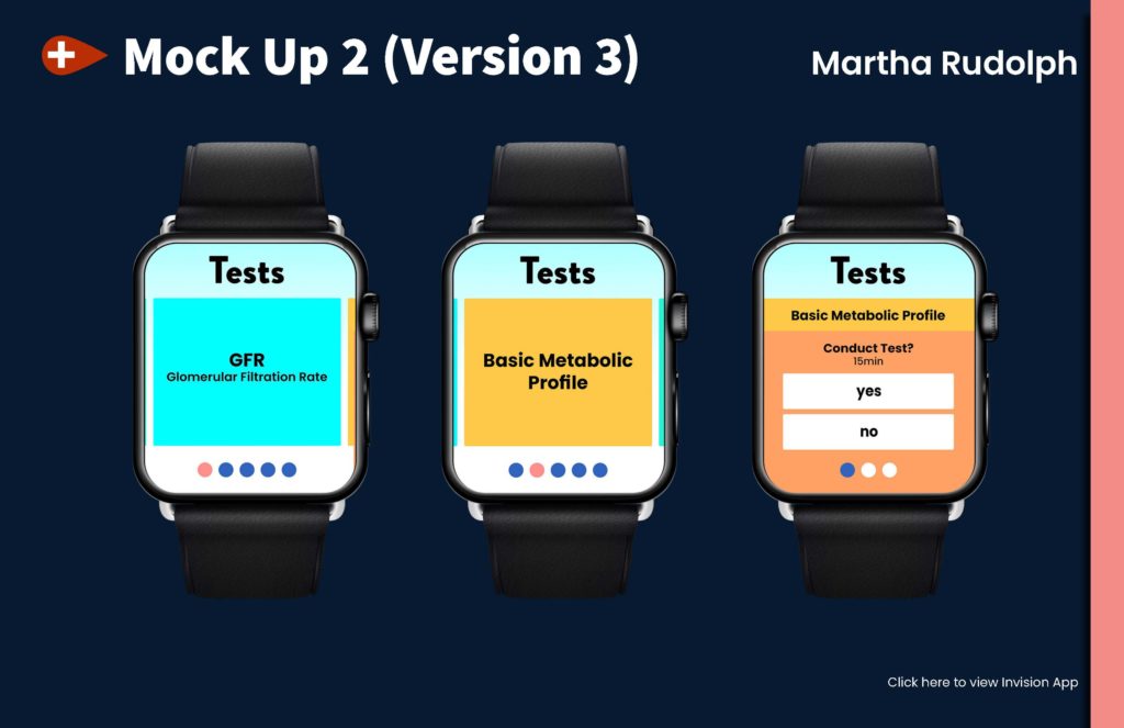
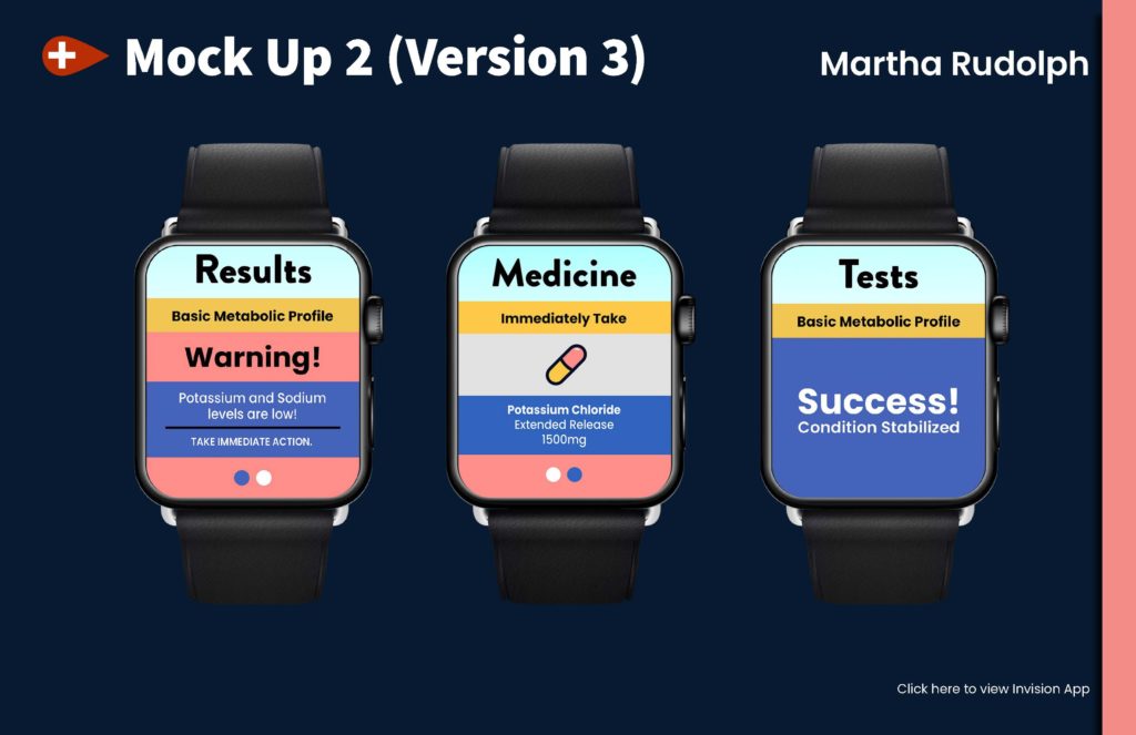
I finalized the phone and watch application. For the phone, I added more iconography to make things more visually interesting and provide visual cues for the users. Also, I added a menu to the layout. For the watch application, I continued to make the buttons larger and I pushed the design to work outside of the limitations of the display. So, now instead of listed menus, items are now scrollable. Also, the colors used in the watch were worked to have more contrast so they are more accessible.
